Sep 25, 2026Startup & Private Label Guides
Premium-Looking Lip Packaging Without Tooling: Stock Components Plus Custom Decoration
Stock lip gloss tubes, mascara tubes, bottles, jars, and droppers can all be customized without new tooling.
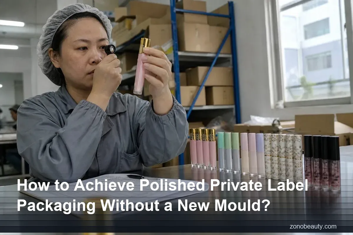
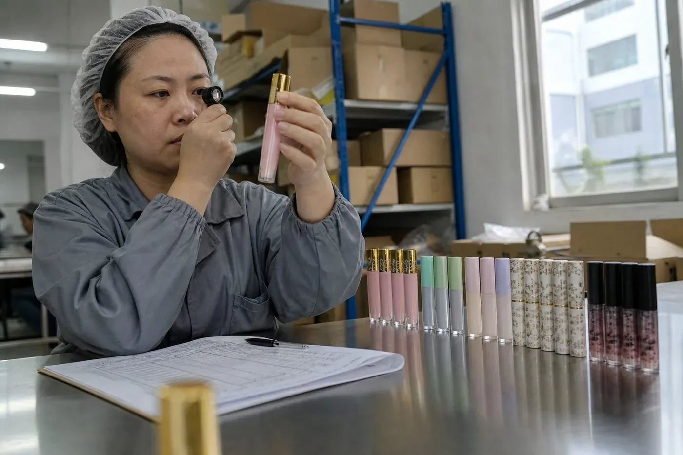
A founder asked me whether polished private label packaging 1 always demands custom tooling. After coordinating lip gloss and mascara projects through vetted partner factories in China, my answer is no.
You can achieve polished private label packaging without a new mould by choosing a proven stock component, then layering custom decoration—silk screen printing, hot foil stamping, shrink sleeves, custom-colored resins—plus coordinated closures, labels, and secondary packaging. The polish comes from the design system, not the shape.
New moulds tie up cash before you sell a single unit. They stretch timelines and lock you into one shape while your market is still telling you what it wants. The good news is simple. Most of what a shopper reads as "premium" comes from color, print, finish, and presentation. All of those can sit on an existing structure. Below, I walk through what you can customize, how to make stock parts look bespoke, which decoration methods earn their cost, and how to keep formula and packaging matched when you skip the tooling.
What stock packaging options can I customize without commissioning a new mould?
Last month, a London-based lip gloss founder asked me for a bespoke tube shape. After reviewing her budget, we mapped what our partner factories' stock packaging solutions could deliver instead.
Stock lip gloss tubes, mascara tubes, bottles, jars, and droppers can all be customized without new tooling. You can change colors, closures, wipers, applicators, surface finishes, labels, and cartons—anything that decorates or pairs with the existing structure rather than altering its core geometry.
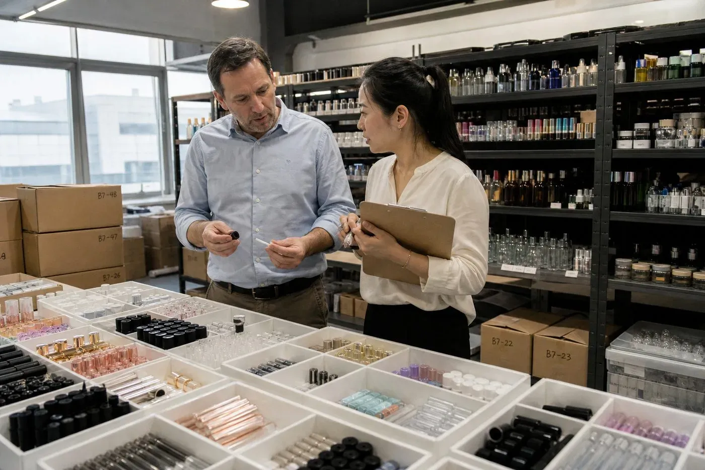
The distinction sounds technical, but it is easy to hold in your head. A mould defines the shape of a component. Everything applied to that shape, or attached to it, is fair game without new tooling. In our project lines—lip gloss tubes, mascara tubes, and the finished lip and eye products that fill them—this covers far more ground than most first-time buyers expect.
The decision line: decorate versus re-engineer
Here is the framework I sketch for buyers during brief intake:
Usually possible without a new mould | Usually requires a new mould |
|---|---|
Logo, label, graphics, and copy | Overall tube, bottle, or jar shape |
Resin or glass color changes | Major dimensional changes |
Compatible caps, wipers, and applicators | New cavity geometry |
Surface decoration and finish | Structural ribs, undercuts, or custom contours |
Carton and outer packaging | Fully proprietary form factor |
Standard capacities and neck finishes | Unique functional architecture |
Suppliers increasingly position this as semi-custom or "existing mould customization," and for good reason. You skip custom tooling costs, you shorten development, and stock components usually carry a lower minimum order quantity than tooled projects. The exact MOQ still depends on the component, decoration method, and factory, so we confirm it against each specific project scope rather than quoting a blanket figure.
When a new mould still makes sense
I will not pretend tooling is never worth it. Brands that have proven demand, need a proprietary shelf silhouette, or require category-specific function sometimes outgrow stock formats. A bespoke mould gives stronger brand ownership. But it also carries higher upfront cost, longer timelines, and real risk if demand is uncertain. For a first launch or a market test, I almost always steer buyers toward the stock route first.
✔ Changing the resin color of a stock tube does not require new tooling TrueCustom color masterbatching runs tinted resin through the same existing mould, so the shape stays identical while the component becomes brand-specific.✘ Using stock packaging means your product will look identical to competitors' products FalseDecoration, color strategy, closures, finishes, and secondary packaging change shelf appearance so much that two brands on the same base tube are rarely mistaken for each other.
How do I make off-the-shelf tubes and bottles look like a custom private label design?
There is a trade-off I weigh on nearly every brief: decoration budget versus tooling budget. Coordinating projects across the US, Europe, and the Middle East, decoration usually wins.
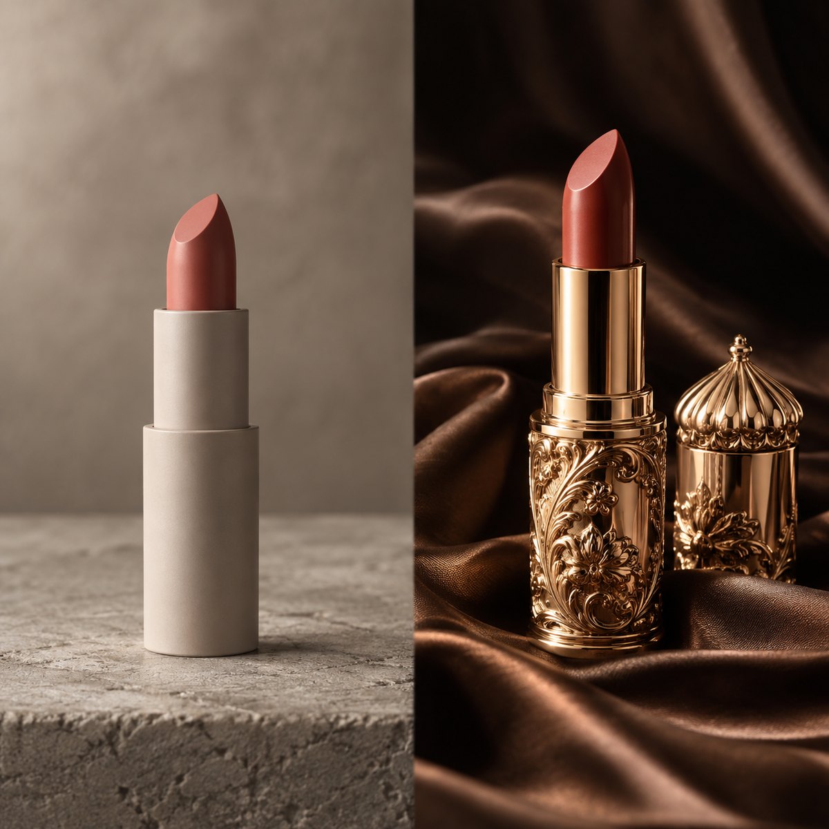
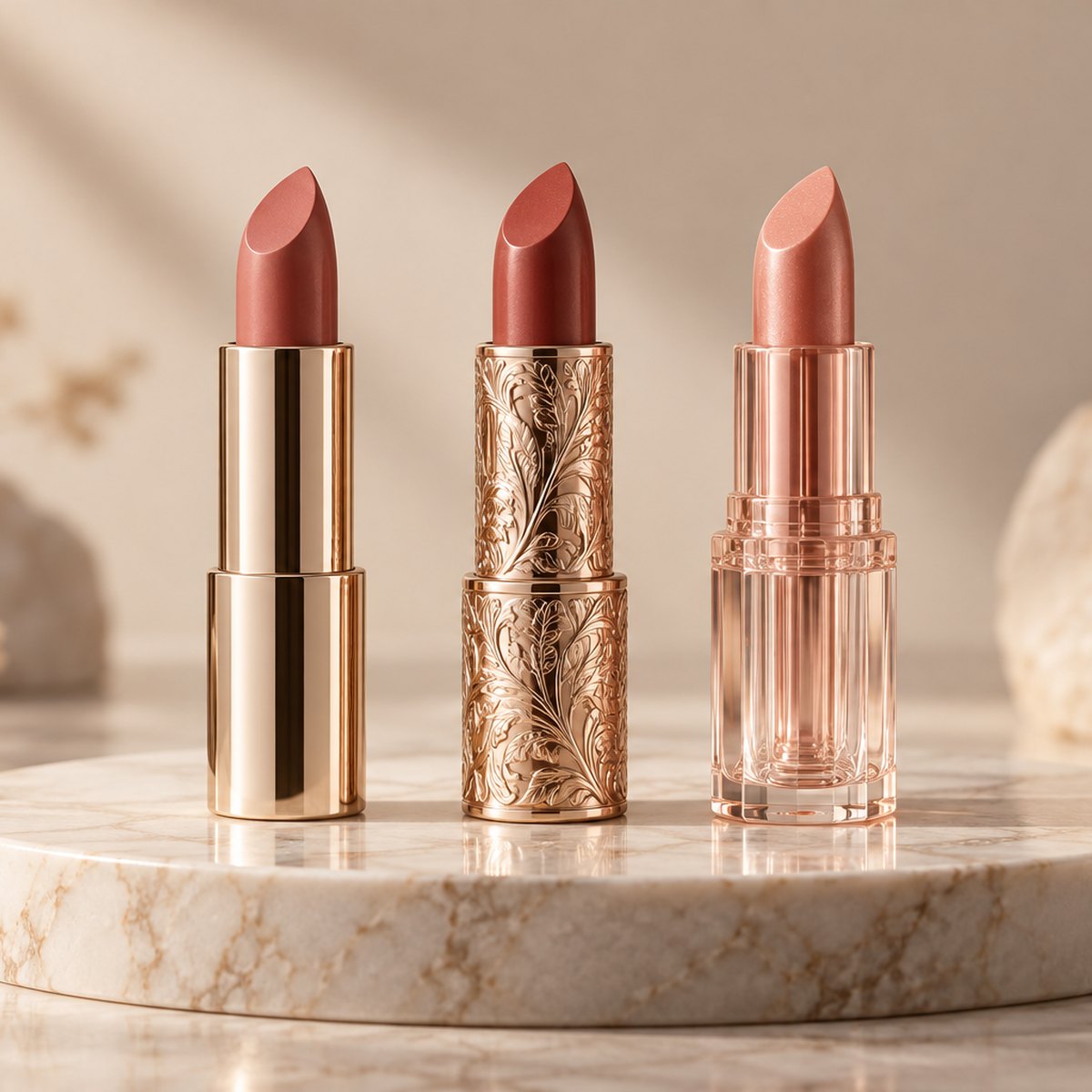
Make off-the-shelf packaging look custom by building a design system: Pantone-matched resin colors, coordinated closures, direct printing instead of visible label edges, restrained two- or three-color palettes, premium surface finishes, and branded secondary packaging that completes the unboxing experience.
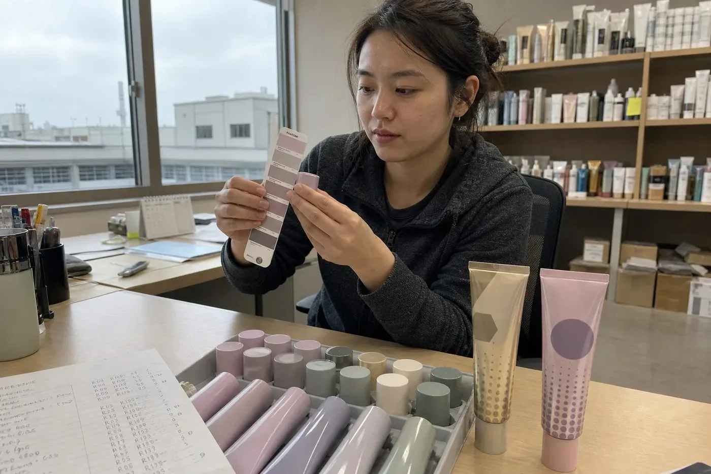
The mistake I see most often is treating customization as one move—usually a logo sticker—instead of a system. A single change on a stock tube reads as private label. Five coordinated changes read as a designed product. Here is the sequence I walk buyers through:
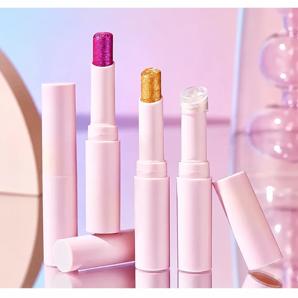
- Lock the color story first. Custom color masterbatching lets partner factories run stock tubes in your exact Pantone reference. A tone-on-tone body and cap, or a restrained two- or three-color palette, signals quality faster than complex artwork does.
- Swap the visible components. Pairing a standard bottle with a differently colored or shaped closure, wiper, or applicator changes the silhouette without touching the mould. This is the cheapest way to alter how the product reads at arm's length.
- Remove the label edge. Printing directly onto the component makes graphics look molded-in rather than stuck on. Shoppers register this subconsciously.
- Control the finish. Matte, soft-touch, frosted, or metallic surfaces create an expensive hand feel. A frosted lip oil bottle with a glossy logo is a classic tension that works.
- Design the secondary packaging. Thoughtful secondary packaging design 2—a printed carton, a belly band, branded tissue paper—turns a stock component into a complete retail-ready product. For DTC brands, the unboxing moment is often where brand identity aesthetics do their heaviest lifting.
- Add one signature detail. An NFC tag behind the label for tap-to-verify content, a high-build digital varnish that simulates texture, or a specialty coating that changes surface feel can each give a stock pack a story competitors on the same base cannot copy easily.
Buyers sometimes push back: "If competitors can buy the same tube, how different can I really look?" My honest answer is that premium minimalism dominates current shelf trends anyway. Restrained systems, consistent print quality, and one memorable finish beat exotic shapes in most beauty categories. The shape is the least-noticed part of the system when the rest is disciplined.
What decoration methods, like printing, hot stamping, or sleeving, work best for polished private label packaging?
During a recent pre-shipment inspection, a gold logo had drifted off-center on part of a mascara tube run. That batch taught our team to specify decoration tolerances upfront.
Silk screen printing suits logos and simple graphics on tubes; hot foil stamping adds metallic accents; shrink sleeve labeling delivers full-coverage artwork on complex shapes; digital printing handles multi-shade lines at low volumes. Most polished private label packaging combines two methods on one component.
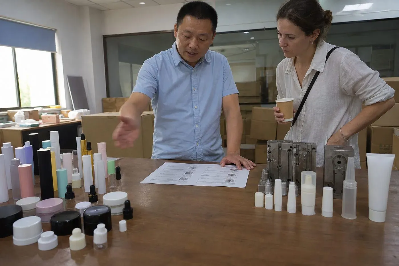
Because this is a genuine trade-off decision, I always start buyers with a side-by-side view before we discuss artwork:
Method | Best for | Look and feel | Watch-outs |
|---|---|---|---|
Silk screen printing | Logos, line art, text on tubes and bottles | Clean, durable, "molded-in" look | Limited color counts per pass; setup per design |
Hot foil stamping | Metallic logos and accents | Luxurious, reflective, tactile | Registration drift; needs tight tolerance specs |
Shrink sleeve labeling | Full-coverage artwork on curved or complex shapes | Vivid, 360-degree graphics | Seam placement; distortion on tight curves |
Pressure sensitive labels | Fast changes, small runs, multi-SKU lines | Flexible and economical | Visible edges; lifting if surface energy is wrong |
Digital printing technology | Multi-shade collections, gradients, short runs | Photographic detail, no plate costs | Verify durability against oily formulas |
Laser etching | Permanent marks on glass or metal parts | Integrated, artisanal, wear-proof | Single-tone only; component material matters |
Combining methods is where the polish comes from
The strongest results I coordinate rarely use one technique alone. A silk-screened body 3 with a hot-stamped cap accent. A shrink sleeve on the tube with an embossed, spot-UV carton. Matte lamination on the box with a soft-touch coating on the component. Layering two or three finishes creates the tactile contrast that shoppers read as expensive.
Print quality is the whole game
Here is the objection worth taking seriously: standard packaging can absolutely look generic when color control and registration are sloppy. That is a process problem, not a stock-component problem. We handle it by locking a golden sample before bulk production, writing decoration tolerances into the order, and checking placement, adhesion, and color against that sample during quality inspection. Digital printing technology has also narrowed the gap for small brands—multi-shade lip lines can now carry distinct artwork per shade without plate charges for each design.
✔ Combining two decoration methods on one component is a standard route to a premium look TruePairings like silk screen printing plus hot foil stamping, or a sleeve plus an embossed carton, create tactile and visual contrast that a single technique rarely achieves.✘ Digital printing always looks cheaper than screen printing FalseModern digital printing reproduces gradients and photographic detail that screens cannot, and on short multi-shade runs it often delivers the more refined result.
How do I avoid mismatched packaging and formula when I skip a custom mould?
One lip oil project taught me a lasting lesson: the stock tube was flawless, but the wiper choked on a thicker formula. We caught it in sampling, thankfully.
Avoid mismatches by running formula-to-packaging compatibility checks before bulk production: test wiper fit, applicator pickup, seal integrity, and formula-material interaction on the exact stock component, then lock a golden sample that both the filler and the packaging supplier sign off against.
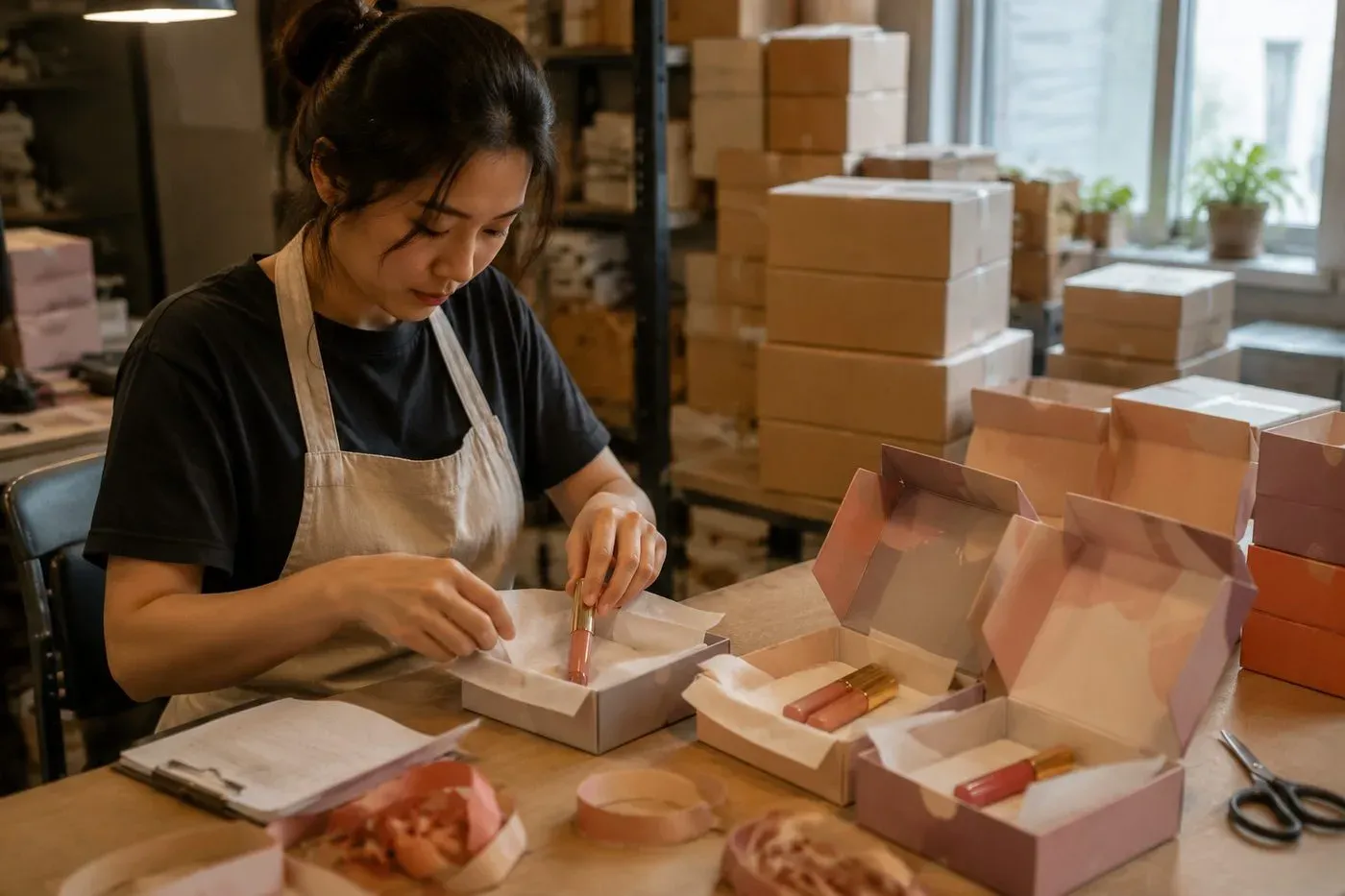
Skipping a mould removes tooling risk. It does not remove compatibility risk. A stock component was engineered around someone else's formula, not yours. Viscosity, oil content, and pigment load all change how a wiper scrapes, how an applicator picks up product, and how a seal holds during shipping. This is exactly why our coordination window runs sampling and compatibility checks as one connected step, not two separate suppliers guessing at each other.
Where mismatches actually happen
Product | Common mismatch risk | What we check in sampling |
|---|---|---|
Lip gloss / lip oil | Wiper too tight or too loose for viscosity | Wiper drag, doe-foot pickup, stringing, leakage after inversion |
Lip tint | Pigment staining or separating in the reservoir | Material interaction, sedimentation, applicator streaking |
Mascara / eyeliner | Brush or wiper geometry fighting the formula | Load consistency, clumping, drying at the wiper, seal integrity |
The workflow that keeps sample and bulk aligned
Our process runs as one sequence: brief intake, supplier matching by formula, packaging, MOQ, budget, and target market, then sampling with compatibility checks, golden sample approval, bulk production follow-up, quality inspection, export documentation 4, and shipment. Sampling rounds typically land within a few weeks depending on decoration complexity, and we confirm exact timing, sample fees, and MOQ against each project's scope before anything is committed.
Who owns compliance
One point I state plainly to every buyer. Partner-factory certifications and test reports are available upon request, but regulatory, labeling, and safety-assessment responsibility 5 sits with the brand owner or the appointed responsible person in the target market. No supplier can truthfully tell you a cosmetic is "FDA approved," because the FDA does not approve cosmetics that way. Build your label review and safety assessment into the timeline; do not bolt it on after the golden sample.
✔ A stock tube that works with one gloss formula can fail with another TrueViscosity and oil content change wiper behavior, applicator pickup, and seal performance, so every new formula needs its own compatibility check on the exact component.✘ Skipping a custom mould means you can skip compatibility testing FalseStock components still interact with your specific formula; testing on a proven structure is faster, but it is never optional.
Conclusion
Polished private label packaging is a design system, not a shape. Stock components, disciplined decoration, coordinated secondary packaging, and strict compatibility checks deliver a custom look without tooling risk.
If you are weighing this route for a lip, eye, or nail launch, I am happy to look at your project. Send a short brief covering your product type, target market, shade count, packaging direction, expected quantity, and any reference products you admire. We will map it against suitable partner factories and come back with a clear, explained path from sample to shipment—with MOQ, pricing, sample fees, and documentation confirmed against your specific scope.
Footnotes
4. Government resource for understanding the required documentation for international trade and shipping. ↩︎