Purple Press-On Nails: Why This Colour Sells Across Seasons
Purple press-on nails carry search demand that most colour families never reach. The shades that sell, the buyers behind them, and how to stock purple without over-committing.
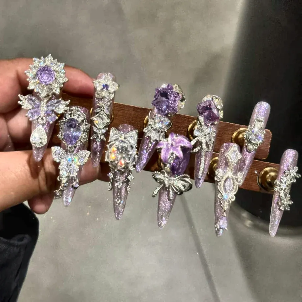
Most colour families have one season. Purple has a calendar: lavender runs through spring, violet and lilac peak in summer, deep plum and aubergine carry autumn, and purple glitter owns the holiday party window. That spread is why purple keeps its own search demand while trend colours appear and disappear.1
Purple is not one colour on a shelf, it is five or six demand waves across a year. Stock purple as a planned rotation of shades rather than a single best-seller, and the colour pays for the shelf space four seasons in a row.
This guide walks the purple family from shade to buyer: which tones sell in which window, how decorated purple designs change the price conversation, and what to confirm before stocking.
The Purple Family, Shade by Shade
Lavender is the softest entry and the widest wearable: it photographs pale, suits office settings and carries spring searches. Violet and lilac sit one step brighter and drive the summer social-media wave. Orchid and magenta-purple are statement shades with younger buyers. Plum and aubergine are the autumn anchors, and purple glitter finishes take over from late October onward.23
| Shade | Peak window | Buyer it serves |
|---|---|---|
| Lavender | Spring into early summer | Office and everyday wearers |
| Lilac | Summer | Trend-led social media buyers |
| Violet | Summer festival season | Statement and event buyers |
| Plum / aubergine | Autumn | Deeper-tone everyday wearers |
| Purple glitter | Holiday party season | Gift and event buyers |
Decorated Purple: Where the Margin Sits
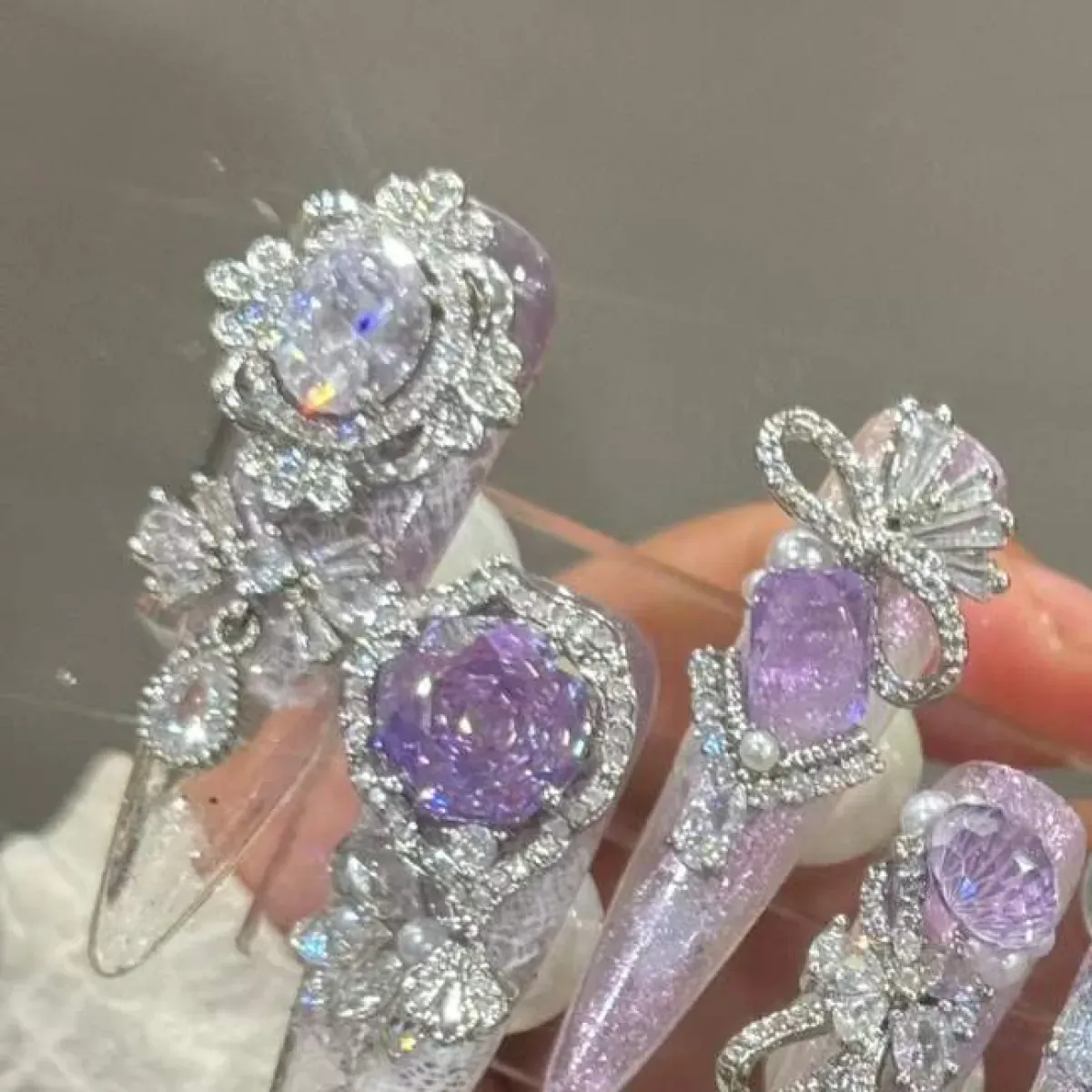
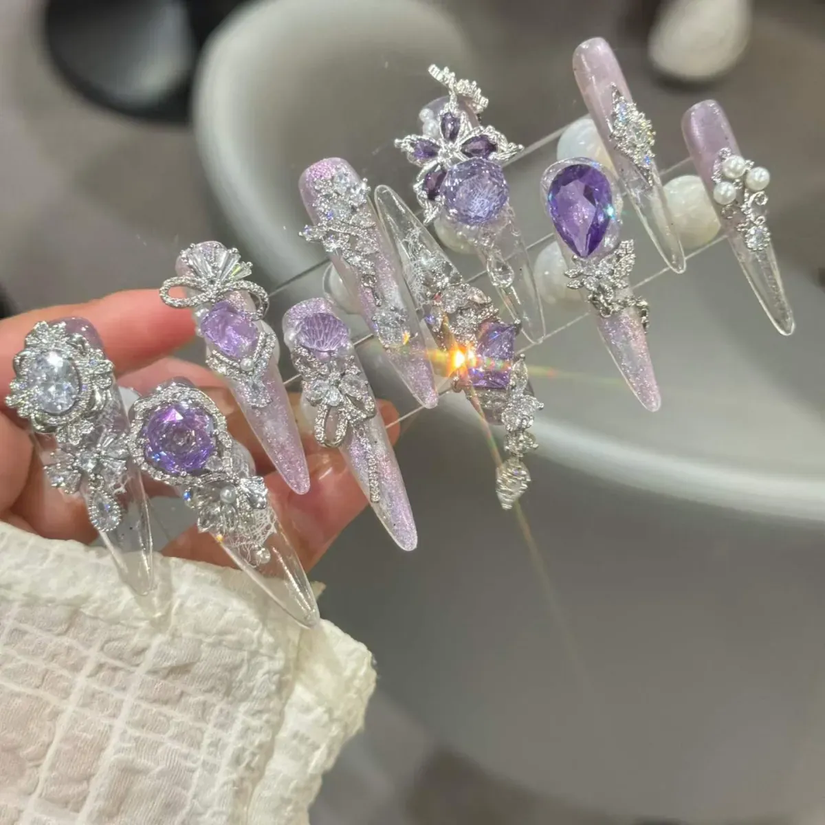
Plain purple sets compete on price. Decorated purple sets compete on design. Crystal settings, 3D butterflies, bows and silver relief work each add production steps, and each step moves the set into a higher perceived-value tier where the buyer compares artistry rather than unit price.
Butterfly charms deserve a specific note: they have stayed a durable motif inside purple designs for several seasons running, because the silhouette reads clearly in photos and pairs with both pale and deep purple bases. When you shortlist decorated purple designs, ask how the charms are attached and how they travel, because attachment quality is the difference between a five-star review and a bag of loose parts.4
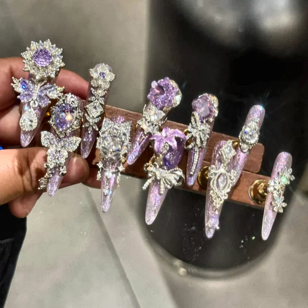
Treat every decorated purple design as its own SKU with its own specification: base shade, charm type, attachment method and packaging. Two purple designs that look similar in a grid can differ completely in what your team has to check on arrival.
Stocking Purple Without Over-Committing
Press-on nail stock mixes start from 50 sets total, which is low enough to carry two or three purple shades as a rotation instead of betting on one. A workable first purple section is one lavender everyday set, one decorated statement set and one seasonal shade matched to your launch window. Review sell-through at your first replenishment, then double down on the shade that moved.
Positioning Purple in Your Store
Purple earns a visible slot: a dedicated thumbnail in the collection grid and a colour-filter tag that works. Buyers who arrive from a purple search bounce if the shade is buried three clicks deep, and the category's search behaviour means a visible purple slot converts that intent the day it lands.
Pairing matters as well. Purple sits well next to neutrals: a lavender set reads softer beside beige and milk-bath tones than it does beside competing brights. In grids and in physical displays, giving purple a neutral neighbour keeps its claim to everyday wearability, while clustering it with pinks turns the whole shelf into a statement wall that suits fewer buyers.
Photography needs one specific correction: strong purple casts colour onto skin and props, so shots on white surfaces drift magenta on some screens. Shoot purple on neutral grey or soft beige backdrops, and check the listing photos on a phone before publishing, because that is where most of your buyers will judge the shade.
Treat purple as a year-round fixture with a rotating foreground: the slot stays, the featured shade changes with the season. That structure captures each demand wave without the re-merchandising cost of rebuilding the section every quarter.
Common Purple Stocking Mistakes
The purple section fails in predictable ways, and every one of them is avoidable at order time rather than at markdown time.
- Buying one deep violet in bulk: the autumn shade dies in spring and the dead stock funds nothing
- Treating lavender and lilac as duplicates: they serve different depths and different seasons
- Letting decorated purple designs share a listing with plain purple: the buyer cannot tell which one ships
- Skipping the colour-cast check on photos: purple drifts magenta on screens and returns follow
- Ordering the statement shade before the wearable one: the volume lives in the wearable shade
None of these mistakes is about taste. Each is a planning slip: a shade matched to the wrong month, two tones assumed interchangeable, or a photo workflow that flatters the sample and misleads the customer. The purple section that works is boringly deliberate: one wearable anchor per season, one decorated statement set, photography checked on the devices customers use.
The wholesale angle strengthens the case. Salons buy purple deliberately: it is the standard colour for seasonal promotions and spring menus, and a salon that finds a supplier who understands the purple calendar becomes a repeat account rather than a one-time order. Retailers who publish the shade rotation clearly make that conversation easy, because the buyer can see at a glance that the range follows the same seasonality their own service menu does.
Timing is the last lever. Purple listings gain traction when they land slightly ahead of the shade's window: lavender in early spring, plum in early autumn, glitter purple six weeks before the party season. An order placed against the calendar arrives with demand already building, which is the cheapest marketing a colour family ever gets, and the reorder lands while the wave is still rising rather than after it has peaked.
Send ZONO Beauty your launch window and preferred purple tones, and we will confirm available designs, decoration options and a quotation for the mix.
Request a purple quotationFrequently Asked Questions
Which purple shade should a first order include?
Lavender for everyday wear plus one decorated statement set covers the widest audience. Add a seasonal deep tone if your first replenishment lands in autumn.
Do purple designs photograph darker than they wear?
Deep purples can lose detail in dim product photos. Request listing photos under your own store lighting before approving the design.
Can butterfly charms be added to a plain purple set we already stock?
Yes, subject to a design review. Send the reference set and the charm style, and we confirm the attachment method and the quantity the customization starts from.
Does purple sell online as well as in store?
Purple's search demand is online-first: buyers arrive by shade name. Online listings need the colour-cast checks described above; in store, the same sets sell on the strong shelf presence of the decorated designs.
What quantity does a purple rotation need?
A three-shade rotation fits inside the 50-set stock mix minimum. That is enough to read sell-through per shade at the first replenishment before any shade gets a larger commitment.
Which purple shade photographs best for listings?
Lavender and mid-violet photograph most reliably: deep plums lose detail in shadow and pale lilacs can blow out. Shoot purple on neutral backdrops and check the result on a phone screen, where most buyers will first see the shade.
Can purple sit inside a mixed seasonal order?
Yes, and it usually should. Purple designs can join a seasonal stock mix so the shade rotation rides on quantities you were ordering anyway rather than on its own minimum and its own risk.
One closing check ties the section together before the order goes out: confirm that every purple listing names its finish, cream, glitter, chrome or pearl, because purple buyers search by finish as precisely as they search by shade. The listing that answers both the shade and the finish question in its title inherits the demand that generic purple listings split and lose to better-labelled competitors.
Conclusion
Purple rewards planning over impulse: map the shades to your launch calendar, give decorated designs their own specification, and let replenishment data pick the winner. A colour family with four seasonal demand waves should never be stocked as a single bet.